Meditations on Murals
A new mural graces the side of a house near Twelfth and W Streets NW. The mural’s bright colors and cartoonish theme have provoked us to think about murals.
Over the past few years, more stunning public art has adorned the sides of Washington’s buildings. Murals in Washington’s neighborhoods, unlike our national monuments and museums, are usually local in subject matter and local in intended audience.
In the mural above, bright colors strike the view because they dominate vast expanses of the canvas. The background is plain white, but that actually enhances the rest of the colors— the corn yellow hair and flesh, the turquoise hat, the brick-red bandanna. This palate is no shrinking violet.
The mural’s cartoon illustration style differs drastically from traditional painting. Notice the lack of gradients; the colors are not blended. The shapes are filled in solidly as they are in a coloring book. As a result there are no shadows and no obvious sources of light.
The subject matter is whimsical, but cohesive. The children on the left are watering flowers in the most cumbersome way. One girl strains to hold up another girl on her shoulders. The girl on the bottom exhibits an expression on her fact that confirms the strain placed on her deeply arched spine.
On the right, a boy dressed like a vagrant in the winter places one hand against the edge of the painting to support himself as he kneels down to inspect a plant on the ground. His left hand on the edge of the painting and the fact the the flowers and grass merge with the grassy field beside the painting subtly call attention to the physical location of the painting. It’s not obvious at first, but this mural is in fact well suited for its location.
* * *
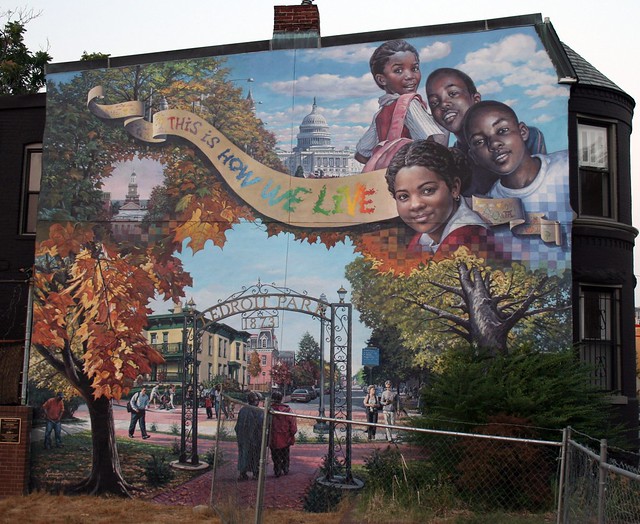
We can contrast this mural with our very own masterpiece in LeDroit Park, “This is How We Live”, another brilliant work, but of a different sort.
The most striking feature of the LeDroit mural is that it makes clear that it is a neighborhood mural. The mural is composed of four scenes skillfully merged into one cohesive work.
The upper-left corner depicts a wreath of tree foliage surrounding the bell tower atop Founders Library on Howard University. The wreath-lined cameo honors the university as a prize.
The lower scene of the LeDroit mural depicts the corner of T Street, Sixth Street, and Florida Avenue. The scene here is an autumnal entry to LeDroit Park featuring the historic McGill architecture on the 500 block of T Street. Our entry gate, a recent addition to the neighborhood, serves as a prominent architectural feature.
The top-right corner features children looking at the viewer— a neighborhood image as children tend to spend much of their time near home. To their left is a view of the Capitol from Pennsylvania Avenue NW. The inclusion of the Capitol is a nod to Washington’s national identity.
The pixelated seams between each scene are unusual, yet successful, methods of merging different subjects. Pixelation is a product of the Digital Age and at first appear out of place in a mural employing traditional portraiture and landscape panting. Nonetheless, the pixelation in our mural is a skillful work of transition.
What do you think of these two murals?
8 Replies
Sorry, comments are closed.


like ’em both
What does the plaque by the LeDroit Park mural say?
i love both of them.
to me, the one on the top actually has more to say about “this is how we live” than the bottom. it is also a newer and fresher take on mural making. the one at the bottom is more about -where- we live and about placemaking.
and it certainly showcases some serious painting and rendering skills.
its great to have the variety of styles.
These murals are both great. We should have move. It makes our neighborhood a little funky without being trashy. They are great!
I like the second one a lot. In passing, I’d have to be careful I didn’t stare at it long enough to crash.
I find the first one pretty offensive…
The first one is tacky and frankly not welcoming. The second is beautiful and speaks to the pride in the neighborhood’s past and hope for its future.
I like the first one, even though I’m not sure what it’s about. It’s creative. The second is pretty, well done and blah.